
Googie: Custom Fonts Accompanied Funny-Sounding Architecture
As the 1940s came to a close and architect John Lautner drew up designs for a number of coffeehouses in Southern California, he unsuspectingly created a new genre with a funny name that would be duplicated as well as disparaged for decades to come. Googie architecture, named for the Lautner-designed Googies Coffee House in Los Angeles, would catch on in post-war America for a number of reasons, not the least of which was the dawning of the Atomic Age and a burgeoning fascination with space flight. The futuristic style would influence not only fellow architects, but graphic artists as it rippled across the country and became prevalent in other American cities such as Las Vegas, Miami and Wildwood, New Jersey.
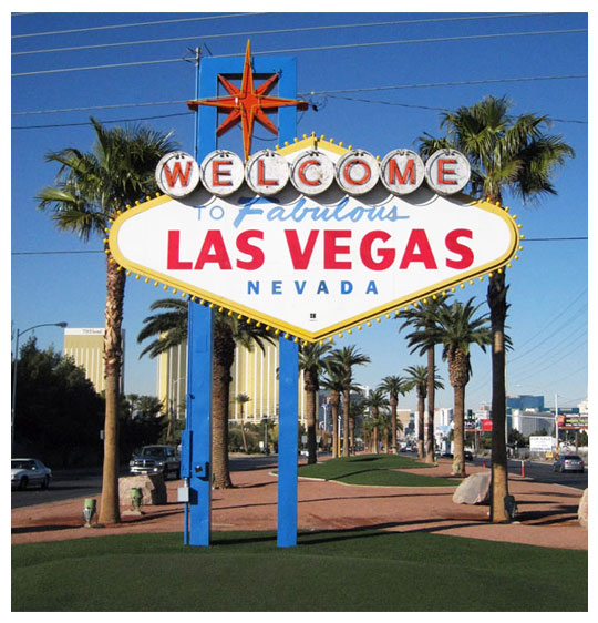
The Welcome to Fabulous Las Vegas Sign Photo by: Pobrien301
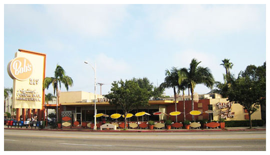
Bob's Big Boy restaurant in the Toluca Lake area of Burbank, California. Photo by Minnaert
It was Douglas Haskell, a critic and editor, who first coined the term “Googie architecture” after seeing the Los Angeles coffeehouse and writing about it in a 1952 article in House and Home magazine. The style is also sometimes referred to as Populuxe, Doo-Wop, Coffee Shop Modern, Mid-Century Modern, RayGun Gothic, Jet Age and Space Age. While Lautner started the trend with coffeehouses such as Googies and Coffee Dan's, other architects -- Douglas Honnold, Martin Stern Jr., Stephen Kanner and partners Louis Armet and Eldon Davis, among them -- were soon influenced by the style and applied it to design all sorts of commercial enterprises, such as gas stations, motels, bowling alleys and other roadside businesses.
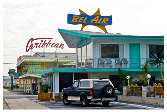
Bel Air and Caribbean Motel signs in Wildwood Crest, New Jersey. Photo by Smallbones
The Growth of Googie Architecture
Although it had an aesthetic that anticipated a future filled with rocket ships and atomic energy, Googie architecture was driven by America's growing dependence on the automobile, teenagers that were emerging as a consumer group and suburban sprawl that began to shift centers of commerce from traditional downtown areas to outlying neighborhoods. Previously nondescript landscapes were soon populated with exaggerated buildings that had upswept roofs, rocket and flying saucer shapes, neon lighting and extensive plate-glass windows. Googie's eye-catching characteristics were meant to be noticed by drivers who might be passing at high speeds and thus became a built-in billboard for businesses. Sharp and severe angles, rounded domes, prominent geometric shapes; and modern materials such as glass, concrete and steel typified the genre.
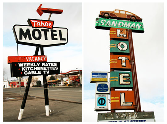
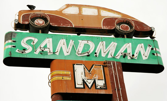
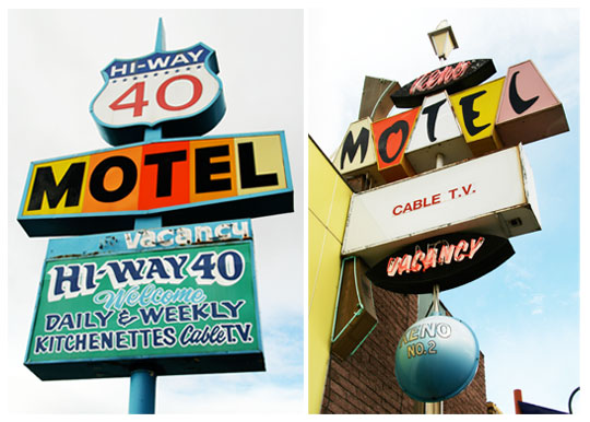
Old Neon and Googie signs from Reno, NV. Photos by Jillian Northrup
“Googie, with its extremes, metaphorical qualities and humor has always been hard to categorize,” according to Chris Jepsen, creator of the website Googie Architecture Online. "Like obscenity, Googie is hard to define, but we know it when we see it." If you have ever flown into Los Angeles or visited Seattle, Washington, you've undoubtedly seen Googie architecture. The iconic Theme Building at LAX airport is an example, as well as Seattle's famous Space Needle, which was built for the 1962 Seattle World's Fair. And while the style is inherently American, there are a few European examples, such as the atomic silhouette of Brussels' Atomium, built for the 1958 World's Fair.
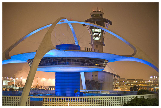
The theme restaurant and control tower at Los Angeles International Airport (LAX). Photo by Michael Zara
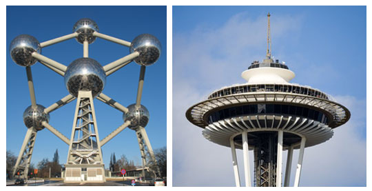
Brussels' Atomium - Belgium. (left) Photo by JeanM1 . The top of the Space Needle in Seattle, Washington. (right) Photo by Cacophony
The atomic model of a nucleus surrounded by orbiting electrons was just one of the motifs that became prevalent in Googie architecture. Boomerang, palette, and kidney shapes were common, as were amebic blobs, starbursts, circles and diamonds -- anything that evoked science, space or movement.
Googie Signs and Fonts Were Integral to Overall Design
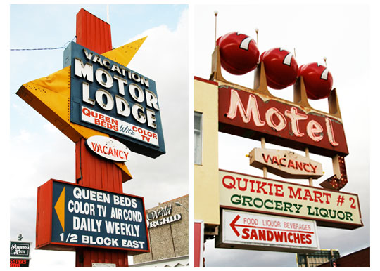
Signage was as important to distinguishing the genre as the architecture itself. Often highlighted in neon, Googie signs were created using bold, chunky block letters of differing colors often accompanied by other letters in script; they were sometimes elongated, angular or rounded like the architecture and, again, embellished with scientific symbols: stars, satellites, atoms, planets. Other characters were offset by their creators who enclosed them in geometrical patterns such as parallelograms, almond shapes, harlequin diamonds or obtuse triangles that denoted arrows.
Old Neon and Googie signs from Reno, NV. Photos by Jillian Northrup
It was not uncommon for Googie architects to have a designer on staff who created lettering specifically for the signage on a construction project, according to architect Alan Hess, author of Googie Redux: Ultramodern Roadside Architecture. In an interview from his Southern California home, the cradle of Googie architecture, Hess said the importance of signage to a Googie project cannot be underestimated and fonts were integral to the overall design of a building.
“They weren't just picked out of a catalog, that's for sure,” Hess said. “Googie as modern architecture was a fully integrated, total piece of design; so the structure, the function and the signage -- including the fonts -- were all intended to be a total piece of art. The fonts were a key part of that; and, of course, it wasn't just on the sign. It was on the menus and the lettering on the waitresses' uniforms -- everything.”
Old Neon and Googie sign from Reno, NV. Photos by Jillian Northrup
He cited the integrated design of Pann's and Ships restaurants in Southern California as prime examples of the overall Googie methodology. Other quintessential Googie signs helped light up Las Vegas in the 1950s and '60s. The iconic “Welcome to Fabulous Las Vegas” roadside sign is one of the best examples of an existing Googie archetype; another was the original sparkling beacon that adorned the Stardust casino and hotel, which was demolished in 2007.
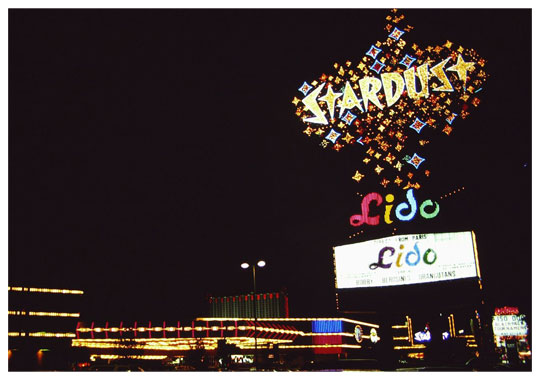
Stardust Hotel and Casino, Las Vegas, Nevaa, USA. Neon sign at the Las Vegas Strip by night, 1990. Photo by Henning Schlottmann (User:H-stt)
When it was designed by the Young Electric Sign Company and installed in 1958, the original Stardust sign exploded in light, color and form on the Las Vegas strip. The freestanding roadside marquee displayed the hotel's name in angular, jagged letters surrounded by a firmament of glittering stars circled by an orbit ring. The main signage on the building itself depicted a solar system with the Earth at its center. In part inspired by the Russian satellite Sputnik, rays of neon and electric light shot out from the 16-foot globe in all directions and other Plexiglas planets spun amidst a sea of neon starbursts. Over the years, the original sign was replaced and the Jetsonian font was substituted with a more contemporary Futura typeface.
Font Designers Capture the Retro Googie Look
Such signs were usually hand-designed without today's modern conveniences of computers, printers and plotters. The then-futuristic lettering would soon inspire typeface designers to create similar display fonts. Those available to graphic designers today are usually referred to a "retro" or "vintage" fonts. Other fonts such as a geometric sans like Futura combined with a slab serif like Clarendon are also thought by some designers to evoke the look and feel of 1950s design.
Old Neon and Googie signs from Reno, NV. Photos by Jillian Northrup
Preservationists Strive to Save Googie Structures
In its infancy, Googie architecture captivated consumers, but was criticized and ridiculed by the architectural establishment for being lowbrow and vulgar. The negative response from his peers was enough for Lautner, who started his career as an apprentice to Frank Lloyd Wright, to distance himself from the genre; he devoted most of his remaining career to residential architecture.
By the mid-1960s, as space flight became a reality and visions of a utopian future changed, Googie architecture fell into decline and as time passed many of the original examples of the style were demolished, much to the dismay of enthusiasts and preservationists. Googies Coffee House itself was razed in 1989. But in recent years, architects, historians, designers and scholars have expressed a newfound appreciation for the genre and preservation efforts to save remaining structures are ongoing.
Search


Photoshop, Illustrator and InDesign are ball leading design software, Photoshop being not...
At Fontscafe we know how busy you are, so we decided to create something for you that was...
Need an easy way to whip up some last-minute Christmas art?
Tada! The 100% absolutely "fre...
We've decided, in the spirit of Valentine's Day, to give away some beautiful Valentine's D...
!!!Updating October 2018:
You can find mow the "Free Chalkbard frames" directly in our "Su...