How Fonts Affect the Subconscious Mind
Well, we all use fonts in our everyday lives – even if we are merely below average computer users. Have you ever thought about why you choose one font over another when you type a letter, a document or a resume for that matter? What is that about a certain font type that makes it ‘just right’ for the job at hand? Let us try and answer this, and more questions in the body of this article.

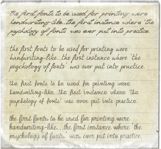
As you can well imagine, books were at first hand written (before printing presses were even present)… once printing technology became practically applicable, it was obviously more productive to use mechanics rather than manual labor to print! BUT a drastic change in the then-time user interface could have had negative effects on the business of selling books, and hence, the first fonts to be used for printing were handwriting-like, which provided a logical transition to the printing era.

Handwriting-like fonts:1 "Soul handwriting" font, 2 "I'm fashionista!" font, 3 "frank handwriting" font, 4 "Contribute" font
So where does this leave a publisher or a printer with the choice use of fonts (or even a web designer for that matter)? Having gone just a little way into this article, if you have read between the lines then you already know that a font with a gothic style speaks of years gone by; they are apt for content that is intended to take the reader ‘back in time’, or maybe pose as a factor that sends across a subliminal message of ‘timelessness’.
Did you ever consider the fact that the background and age group of your readers has a direct effect on their receptivity of the fonts that you choose? Fonts tend to affect ‘readability’ of the text itself, and they are broadly divided into fonts that have ‘tails’, called serifs, at the tops and bottoms of the letters (or serif fonts), and fonts ‘sans’ without the tails.

1_Serif font (with tails/serifs): Book Antiqua, 2_ Sans Serif font (without tails/serifs): Verdana
Today we see many variations of both categories, and hybrids as well. In general, serif fonts are considered more readable that the ‘sans’ types. This could possibly be thanks to generations of people that have grown up as kids learning to hand-write before they ever used a computer – and it will be interesting to see what happens next, with the current generations who are more comfortable with a keyboard than a pen!
Coming back to our discussion on the choice of typefaces, it may be safe to say that most adults on the planet today may feel a certain affinity towards reading handwriting-like fonts. That said and done, studies have shown that uncommon fonts somehow have the effect of improving user understanding of the text on hand. Could this be because of the fact that the reader is forced to concentrate harder on a font that is not very familiar to say handwriting? On the other hand though, fonts that are too hard to comprehend could easily throw the readers’ concentration and interest completely away from the text! In today’s age of extremely short attention spans, this could prove to be quite a reality!
The longer that your text piece is, the more is the possibility of varying emotions being portrayed through the writing (say for example a novel); and therefore more are the chances of requiring different font types to portray different emotions. If you are vey new to the idea of fonts sending across emotional signals, just browse through a novel – why is the title a particular font? Why do western novels have that classic western font? Why does the author choose to italicize certain parts, and to have other parts of the text in bold fonts? Another example that proves the use of fonts to convey emotions, could be children’s books – they almost always have large, friendly looking colorful fonts. Even toddlers who cannot read yet enjoy simply looking at the large curving fonts. This proves beyond doubt that the visual appeal of the font is independent of the content itself, although both need to work hand in hand to create the desired impact on your audience.


